
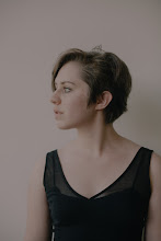
If you're reading this post and you clicked over to my blog, don't worry, you're in the right place....just with a different look. That's right. A different look and a whole lotta of change for this blog!
The thing is...I like simplicity. I like white. I like greys and blues together. And I love the beautifully clean designs that you see all over the web. I love the elegant, yet simple. And if you've got a clean design, you've probably won me over from the start.
The look is pretty different, but this blog and I are different than when I began. My focus on blogging and why I blog has shifted. I've realized that I blog to share the beauty in the ordinary, and also to share my life--my big, beautiful, vivid life. And I want all of you to be a part of that...I want you to all to join me in this gorgeous thing we call life. Sure, it may be convoluted at times, it may be painful, and it may sometimes stink and be unfair. But we've got a greater God than all of that, and with Him walking by us, it makes it all worth it.
Along with that...my blog has its own theme! That was the surprise I was gonna wait to tell you all about...is it not amazing? Jared Kraft did a FABULOUS job and I heartily, heartily, heartily recommend him. It was amazing to hear me, and my blog, put into music. I've been listening to it over and over and over and over again.
Other changes you might notice...
Have a beautifully big day, friends of mine. Oh, and if you're looking for a new blog design of your own, head over to my design studio... :-)
The thing is...I like simplicity. I like white. I like greys and blues together. And I love the beautifully clean designs that you see all over the web. I love the elegant, yet simple. And if you've got a clean design, you've probably won me over from the start.
The look is pretty different, but this blog and I are different than when I began. My focus on blogging and why I blog has shifted. I've realized that I blog to share the beauty in the ordinary, and also to share my life--my big, beautiful, vivid life. And I want all of you to be a part of that...I want you to all to join me in this gorgeous thing we call life. Sure, it may be convoluted at times, it may be painful, and it may sometimes stink and be unfair. But we've got a greater God than all of that, and with Him walking by us, it makes it all worth it.
Along with that...my blog has its own theme! That was the surprise I was gonna wait to tell you all about...is it not amazing? Jared Kraft did a FABULOUS job and I heartily, heartily, heartily recommend him. It was amazing to hear me, and my blog, put into music. I've been listening to it over and over and over and over again.
Other changes you might notice...
- There's only one sidebar. I wanted to have a larger posting area, and in order to make sure that people with smaller screens could still read my posts without having to scroll over, I nixed the double sidebar and stuck with one.
- The Sponsors are gone. Yup. Along with the other changes, I felt like it wasn't right. I'm honored that people want to sponsor my blog, but that's just not the direction that I want this blog to go, nor do I think that that's where its going. On a business site, maybe. On a personal blog where I share beauty and my life...no. My blog is not meant for that.
- The ECS series is gone. Yeah. I know...I never posted about it. It was too much like GTYK, which I realized after I put it up. If you want to join in that, then head over here to Lynnette Kraft's blog.
- Uh...where's the background?! Like I said, I like clean designs and simplicity. I feel like having no background allows my blog to be more open, and truthfully, it's pretty freeing.
What's with the comments? I've been looking at intense debate for a little bit, and with a new blog design (and outlook), well, I thought it was the perfect time to put it up. :-)Okay, I just put back the regular system...felt like it was "easier." ;-)
Have a beautifully big day, friends of mine. Oh, and if you're looking for a new blog design of your own, head over to my design studio... :-)
No comments :
Post a Comment